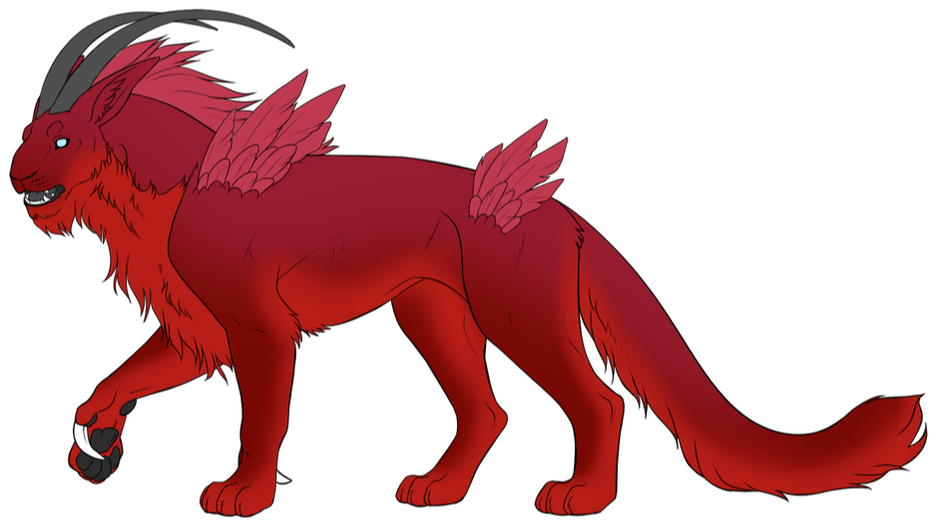
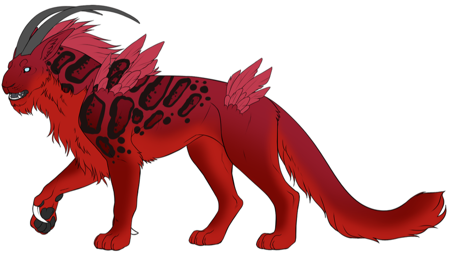
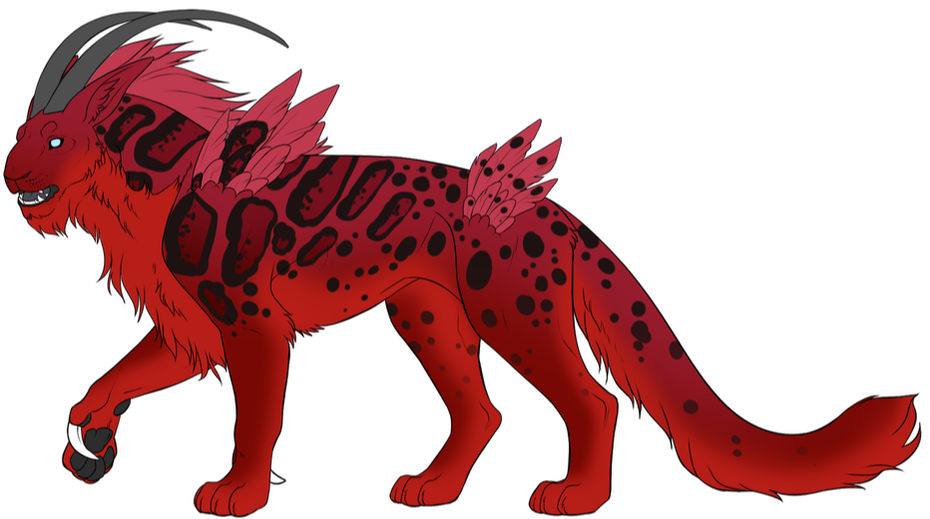
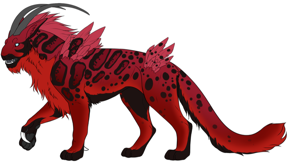
Applying Markings
|
For each of our four markings, we will now reference their individual guides to see what they look like and their range. It's recommended you do each marking on its own layer to make editing easier! Check on our Marking Guides page (see the top navigation under "Design Hub") to read through all the different guides.
|
Most commonly missed rules in this step:
Markings that are derived from the basecoat CANNOT be any color remotely similar to the basecoat - they must be either lighter or darker, with no hue changes from the base whatsoever. This is the utility of using a basecoat gradient, where you have two different colors to pick from! Derived-from-basecoat markings have their own guide, which you can find here.. Markings that are black in color cannot go over 40% saturation in addition to looking black against the base and not getting under 5% value. If you do not feel like using the numerical values your art program provides, please refer to the Jet basecoat palette for picking black marking colors. For more information on these rules, please see this section of the design walkthrough. |
You can refresh your memory on the first page of the Design Guide - Getting Started.